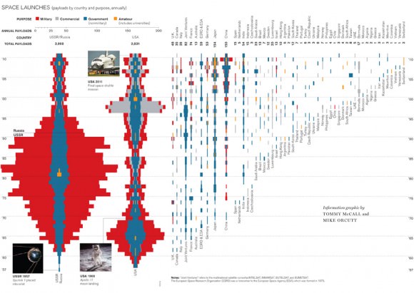
For people who erroneously believe that the end of the space shuttle program means the end of space exploration for the human race, this graphic should provide a little perspective. According to the data compiled here, human missions funded by the U.S. government have represented only a small part of the launches into space. And interestingly, the data creates nice Star Wars battle cruiser-like shapes for US and Russian launches!
Of the 7,000 spacecraft that have been launched into orbit or beyond from 1957 to July 2011, more than half were defense satellites used for communication, navigation, and imaging. Reportedly, the USSR sent up a huge number of satellites because their satellites didn’t last as long as those launched b the Us. In the 1970s, private companies began increasingly adding to the mix, launching satellites for telecommunications and broadcasting.
This graphic groups payloads by the nationality of the owner. A satellite, a capsule of cosmonauts, or a deep-space probe would each count as one payload. The data were drawn from hundreds of sources, including space agency documents, academic journals, and interviews. They were compiled by Jonathan McDowell, an astrophysicist at the Harvard-Smithsonian Center for Astrophysics and author of Jonathan’s Space Report, a newsletter that tracks launches.
This graphic is available through a limited-time free access to premium content of Technology Review, who have opened 14 years of premium online content to celebrate their annual Emtech MIT event. Hurry, the limited access ends on October 19, 2011. You can download a pdf of the graphic here through that date.
Source: Universe Today

No hay comentarios:
Publicar un comentario